

The hidden function of Brand Design
Good brand design does not try to impress. It tries to make things easier.
When design works, people understand what a business offers, trust it quickly, and feel comfortable using it. When it doesn’t, even a good product feels complicated. That quiet usefulness is the hidden function of brand design.
01
Reducing confusion
Confusion happens when too many visual elements compete for attention. Brand design reduces confusion by simplifying choices and creating familiar patterns. When people don’t have to think about how something works, they can focus on why they’re there.
Example
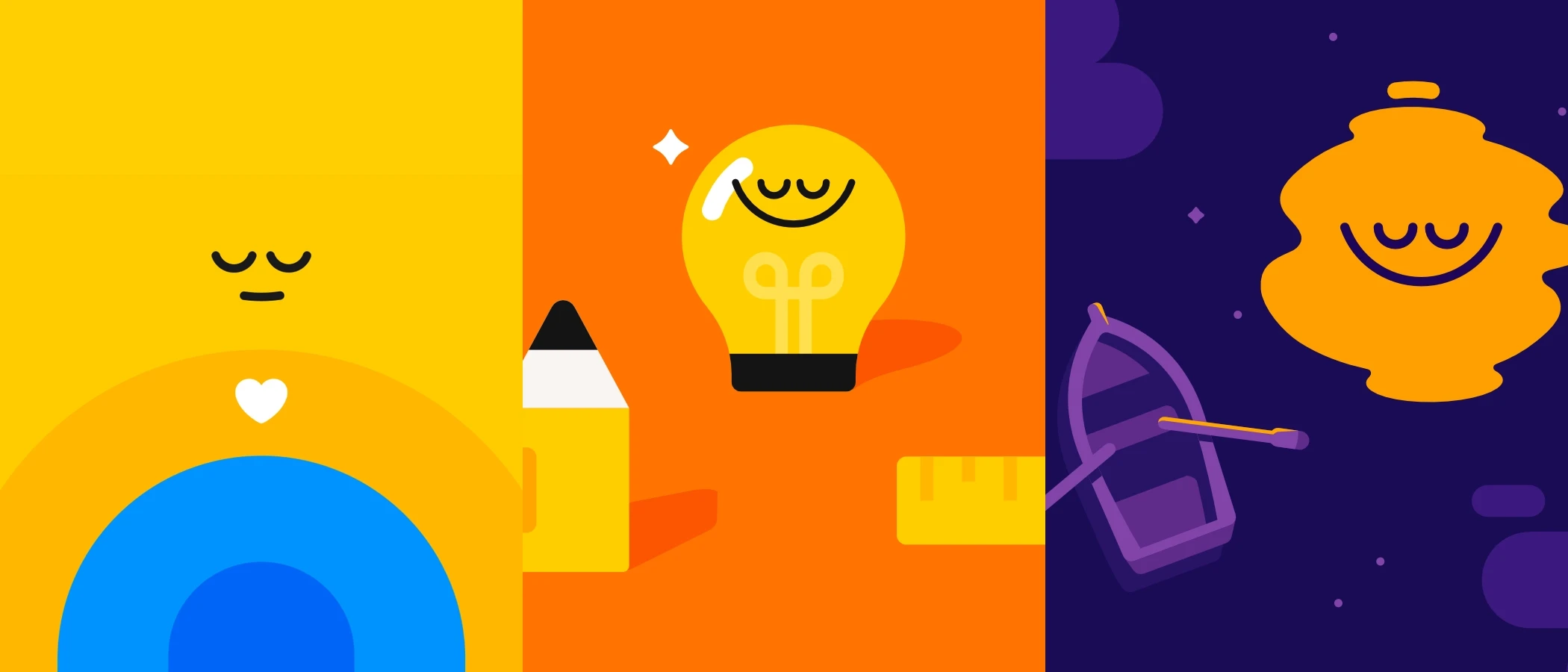
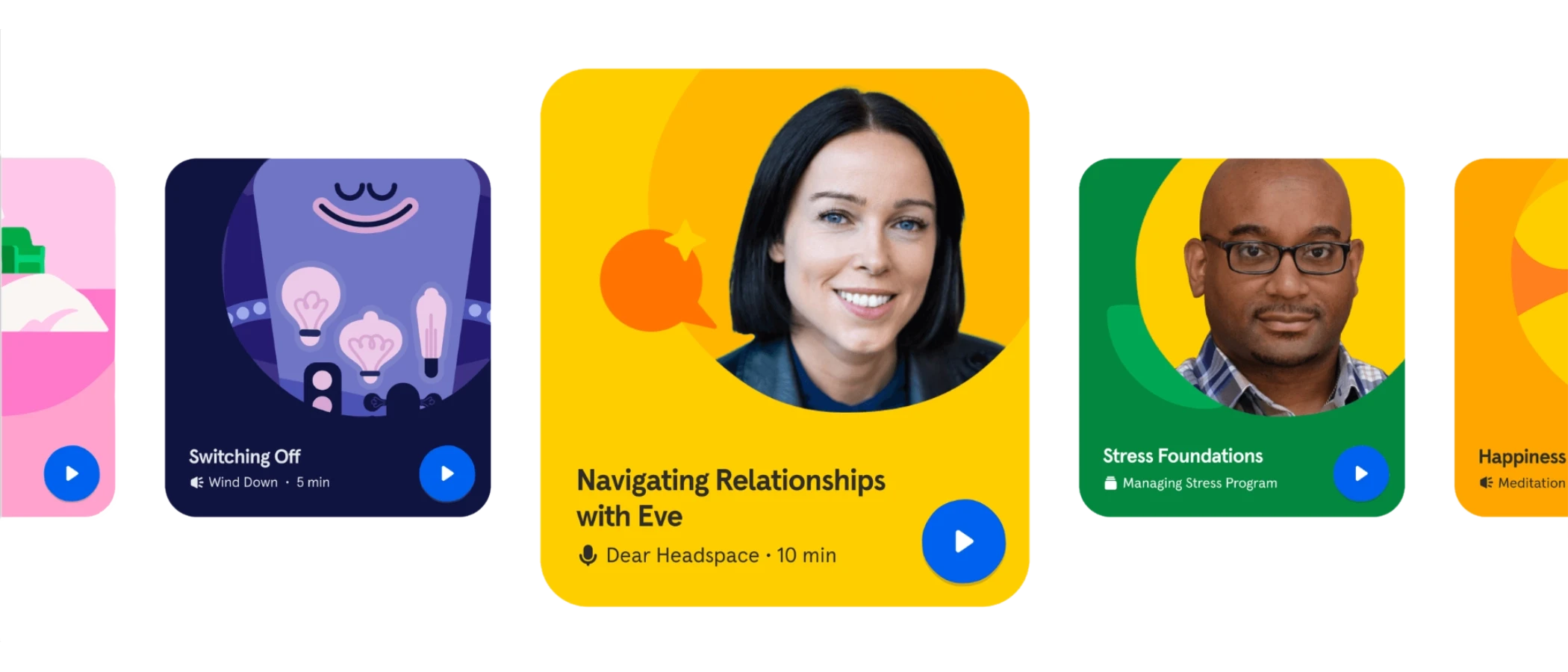
Headspace uses simple illustrations, clear typography, and consistent layouts across its app and website. Nothing feels cluttered or unexpected. Users immediately understand where to begin.
02
Building trust
Trust grows from consistency and control. When design feels intentional and stable, people assume the business behind it is reliable. Inconsistent or careless visuals create doubt, even if the product is strong.
Example
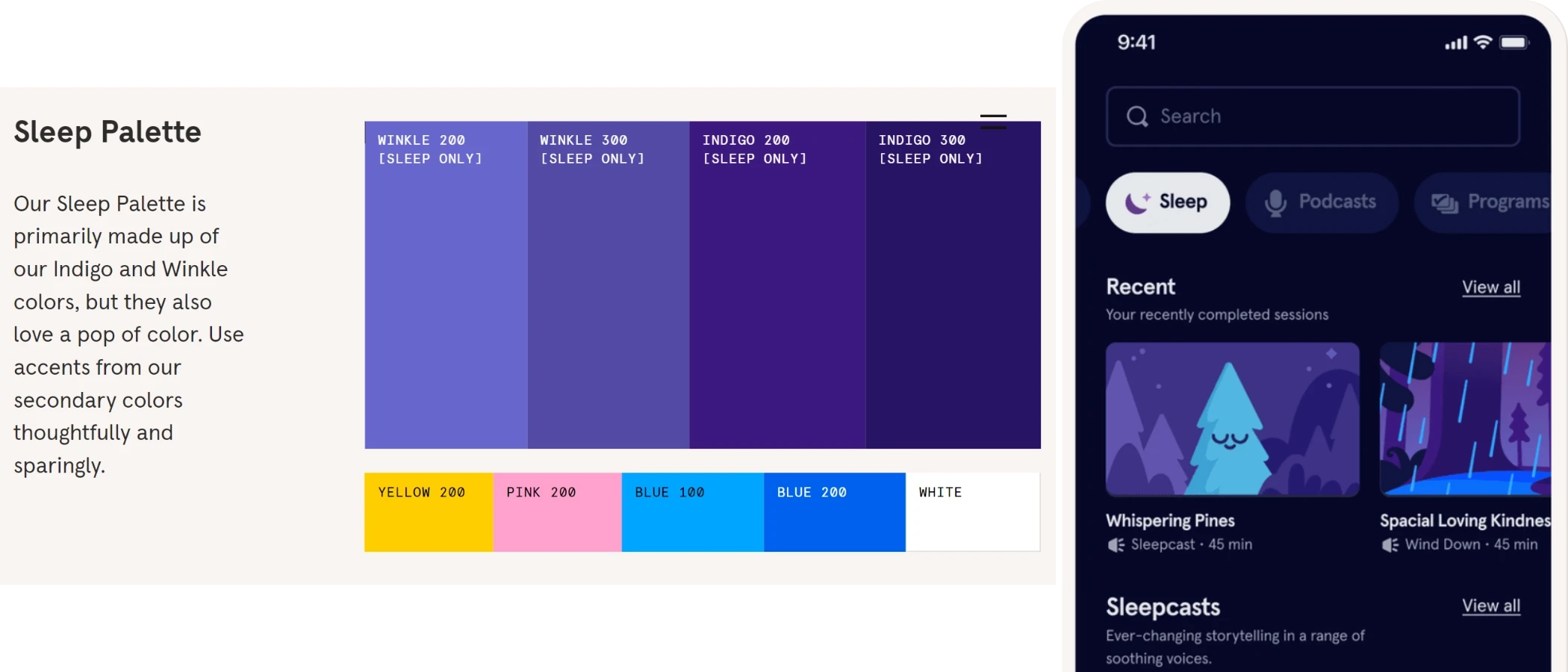
Headspace avoids sharp colors, heavy contrast, or aggressive layouts. The soft palette and friendly visuals create a sense of care and reliability before any content is consumed.
03
Guiding attention
Design should guide attention, not compete for it. Clear hierarchy helps people understand what matters first and what can wait. Without hierarchy, users feel overwhelmed and unsure.
Example
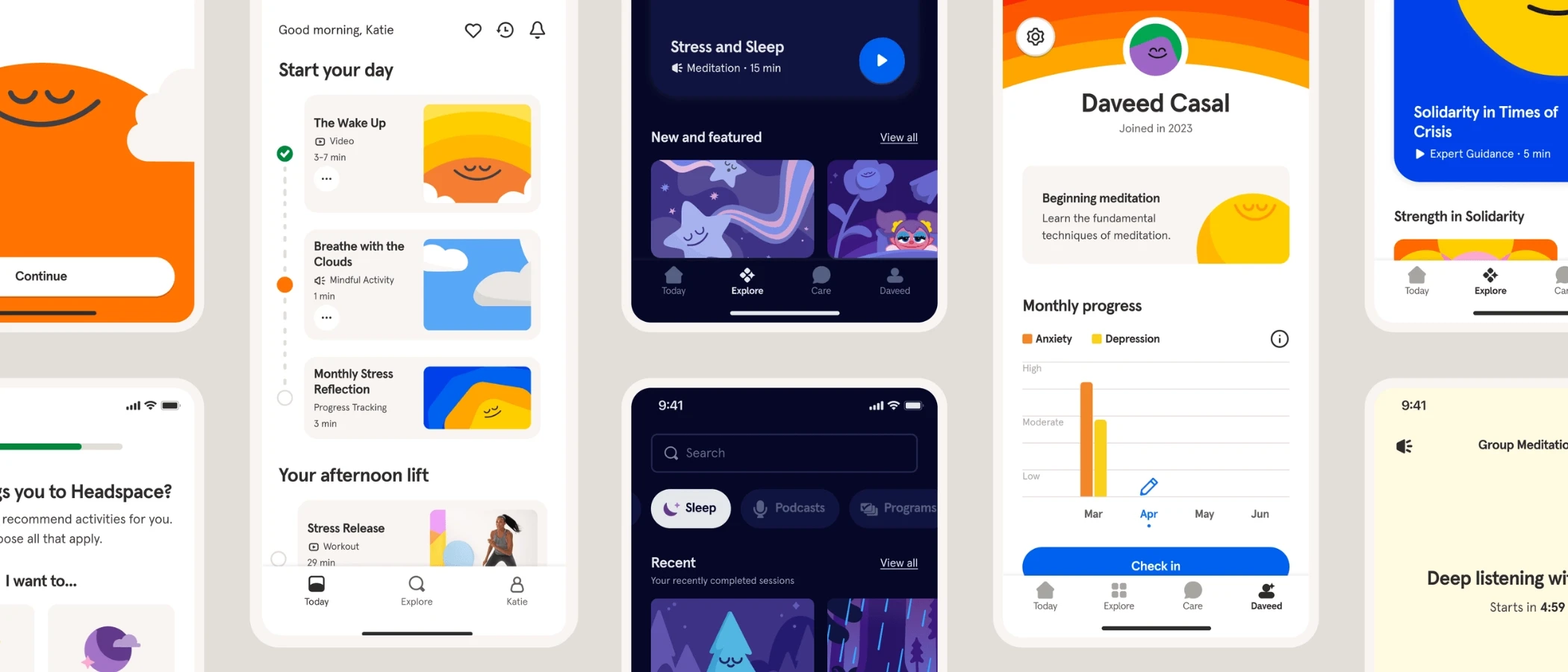
Headspace presents one idea at a time. Headlines are clear, actions are obvious, and nothing competes for focus. The design encourages slow, intentional interaction.
04
Setting expectations
Design sets expectations about the experience ahead. When branding suggests simplicity but the product feels complex, trust breaks. Honest design aligns appearance with reality.
Example
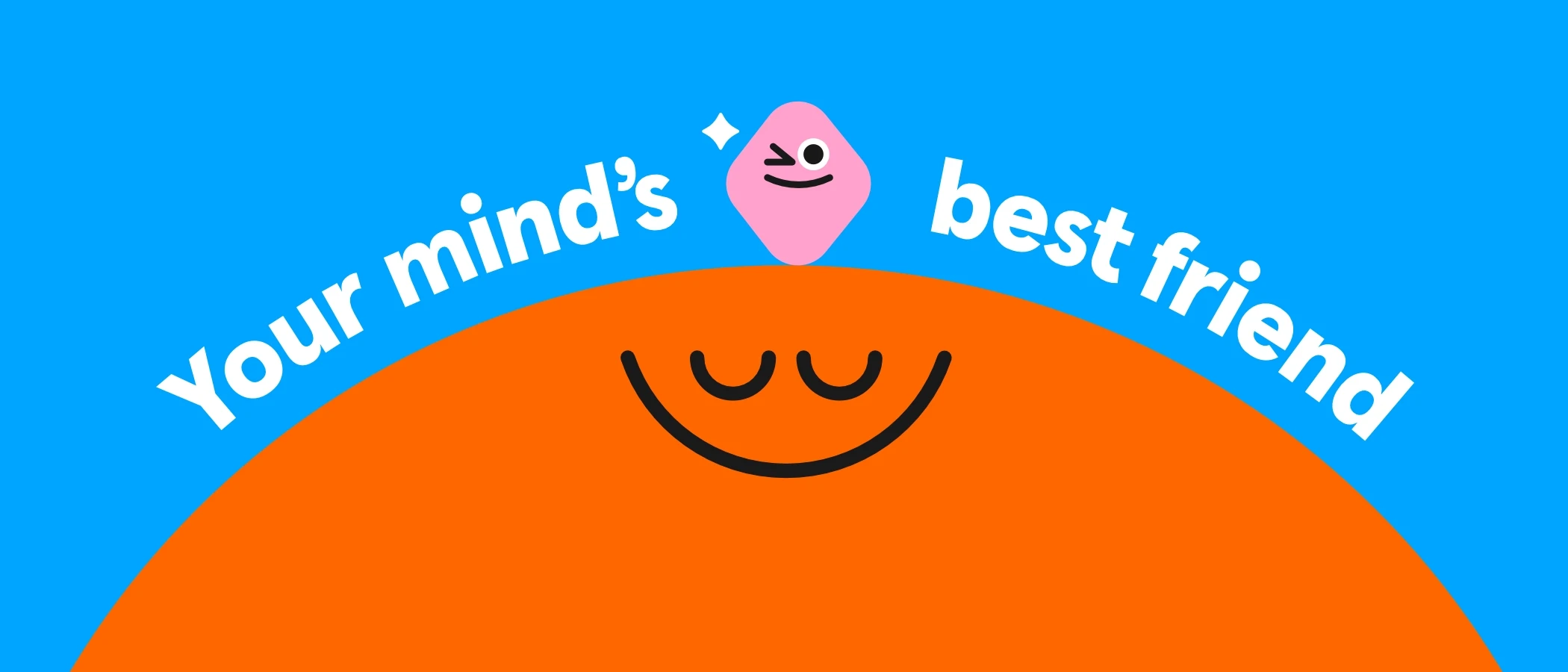
Headspace’s branding suggests calm, simplicity, and ease. The app delivers exactly that. There is no disconnect between what the brand promises visually and what the product provides.
05
Reducing mental effort
Every unnecessary design decision increases mental effort. Good brand design minimizes choices and keeps interactions predictable so users can focus on what they want to do.
Example
Headspace uses familiar layouts and repeated patterns throughout the app. Once users learn how one screen works, they understand the rest. The interface never asks users to re-learn.
06
Improving memory
People remember patterns, not details. Repetition of the same visual language builds recognition over time. Recognition turns into recall.
Example
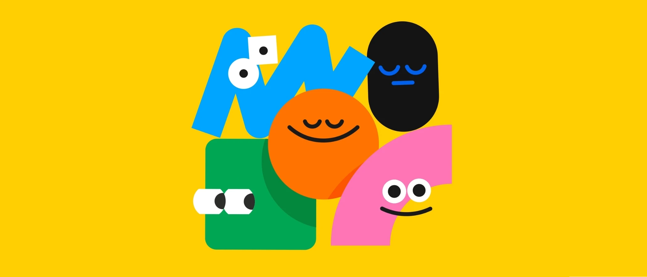
Even without a logo, Headspace’s illustrations, colors, and tone are recognizable. The brand stays memorable because it repeats the same visual cues consistently.
07
Supporting growth
As products grow, design systems prevent chaos. Functional brand design creates rules that allow expansion without losing clarity.
Example
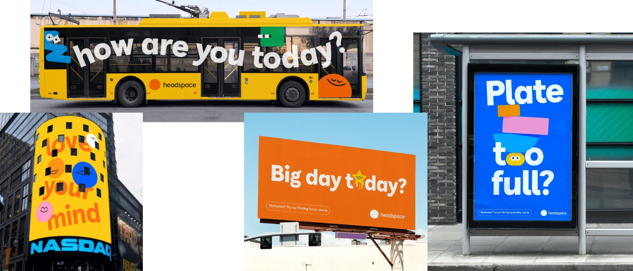
Headspace introduces new features and content without changing its core visual language. Everything still feels familiar, calm, and intentional.
Why This Matters
Good brand design does not ask for attention. It works quietly in the background. When design reduces effort, people feel comfortable. When it doesn’t, people hesitate.
Headspace shows that good design doesn’t shout. It supports, guides, and reassures.
Brand example: Headspace
Visual references used for educational purposes only. All brand assets belong to Headspace.
Source: Headspace Brand Identity System
Further Reading & References
Dieter Rams: Ten Principles for Good Design
Don Norman: The Design of Everyday Things


